The Halide Design System was created as part of the front-end transformation of the Taopix Photo Gift Platform [view separate case study].
The objective of this project was to create a brand-neutral, sector-specific design system that could be used internally at Taopix for faster, more consistent UI development and externally to enable customers to build their own experiences using the Taopix API.
This token-driven system now makes it easy for internal teams to deploy consistent, accessible and performant UI, and for customers to apply their own brand identity to their instances or even use the component library itself to build their own integrations.
Head of Product Design
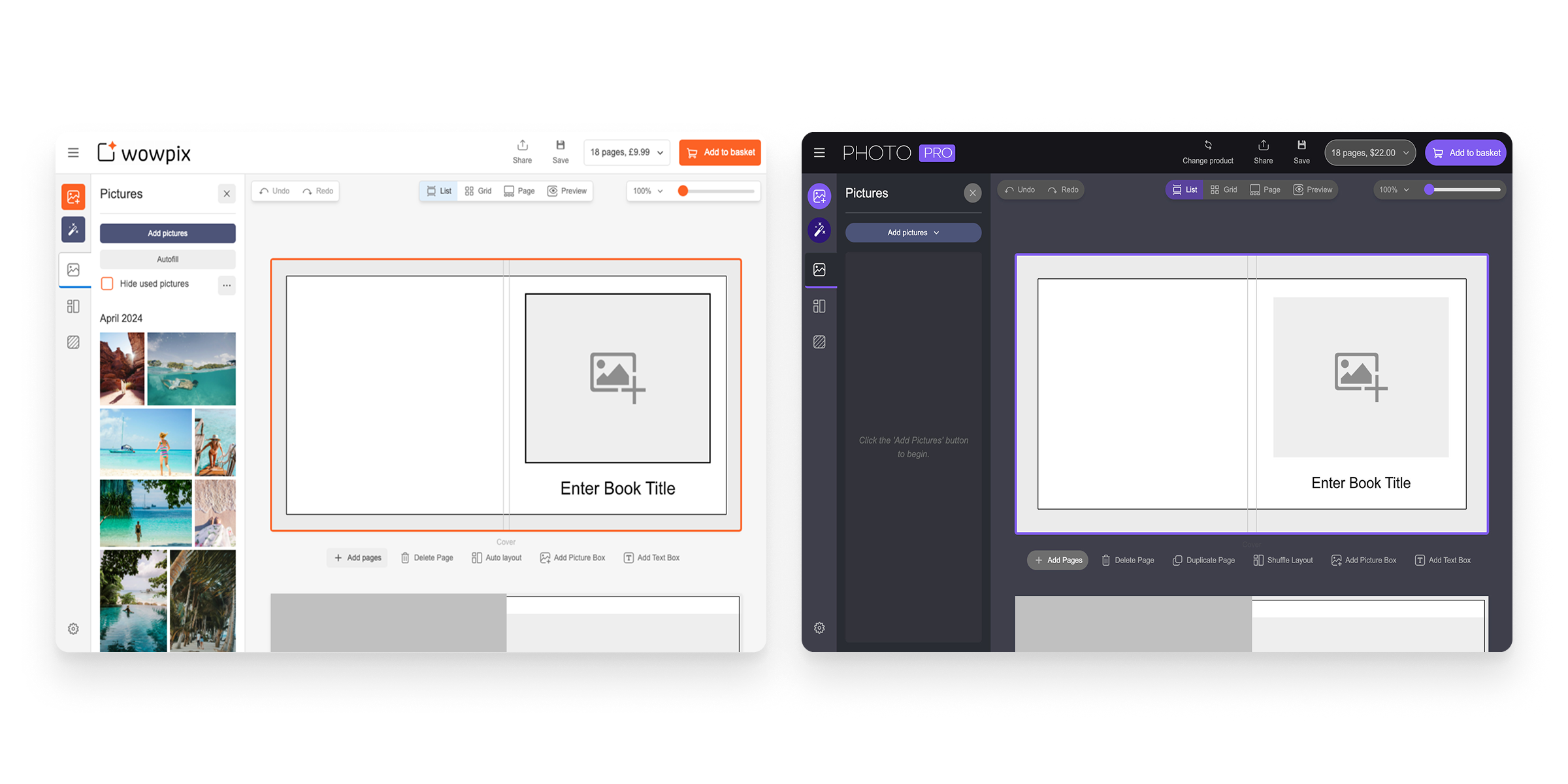
Taopix is a white-label system used by customers under their own brand, and very often across multiple brands in the same system. So apart from providing a framework for us to design and build interfaces for the out-of-the-box product, the design system needed to be both brand-neutral - for the customers who don't want to customise it - and highly customisable for those that do.
This challenge here is that providing a single theme that cascades throughout the UI wouldn't provide enough flexibility. Customers needed the ability to control the aesthetics of different parts of the UI and the various components independently.
The Taopix platform consists of multiple different web applications - a suite of online creative editors and a ecommerce admin system. These obviously serve very different audiences and purposes.
On top of this, one of the key objectives of this design system was to provide customers with a library of components that they could use outside of Taopix to build their own purchase experiences via an SDK that the design system package would eventually be part of.
Documented in Storybook, and with training delivered to the Taopix engineering team, the component library has been very well adopted into the front-end design and build processes at Taopix.
The engineering team have a strong appreciation for the purposes and benefits of the design system, and now use it continuously as well as contribute to it or request modifications to ensure we retain a consistent source of truth.

The design system includes a wide range of components: From form inputs and toggle switches, through buttons and dropdowns to compound patterns such as tab groups and dialogs. It also includes a set of 200+ icons drawn specifically for this system that are appropriate to online print design experiences.
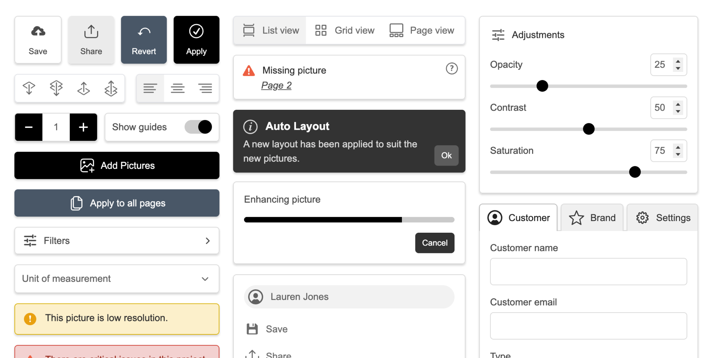

Whilst this is a brand-neutral design system used by Taopix customers under their own brand identity, it is also used by the Taopix platform itself and therefore to ensure consistent aesthetics and interactivity, it was important to include a comprehensive collection of design principles and foundations that the UI team could use to guide their implementations.
These guidelines are documented in Storybook and were shared in training sessions with the front-end teams, but the components also make it easy to use those foundations by exposing layout variations, sizes and spacing via props and tailwind utility classes.
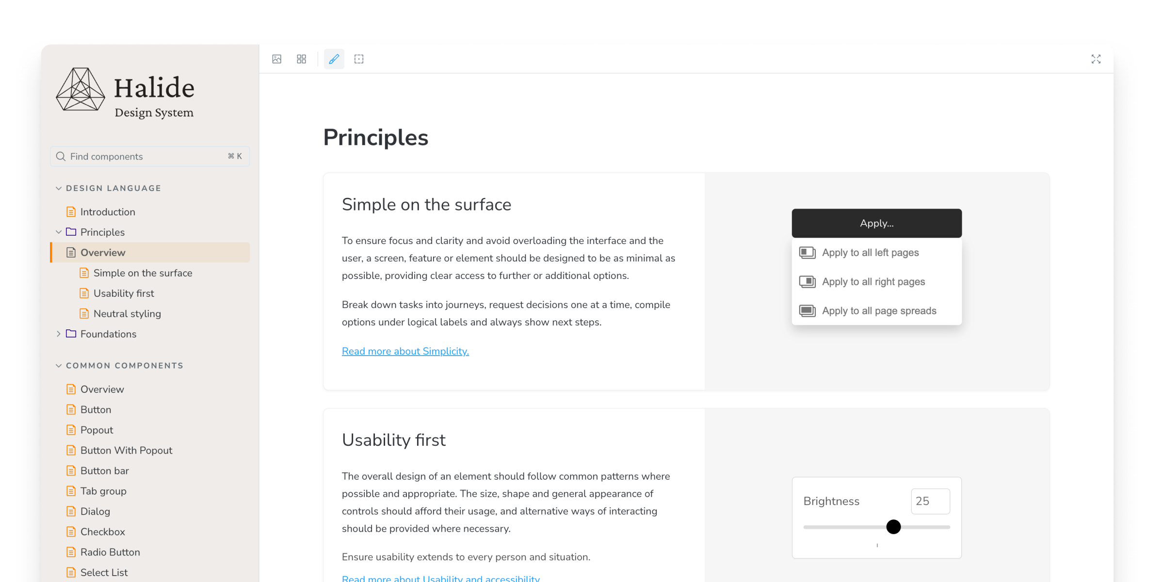
The design system token architecture was built to allow straightforward customisation via a new Theme Configuration system in the Taopix admin console. Customers can now change the aesthetics across all of their product experiences with simple value changes that populate tokens or create sub themes.

Accessibility is baked into all levels of components from atomic elements to large compound components, ensuring it is not only consistently addressed but is controlled and testable centrally.
Components meet WCAG 2.1 AA / EAA standards in the default colour scheme and the general aesthetics and design system guidelines help engineers implement accessible interfaces.
Components like button bars, select lists and tab groups have keyboard control included within them, making it impossible to leave out.
Many components also force the engineer to supply valid accessibility values in order to use the component, so they're not just optional props that are likely to get ignored.
The identity for the design system is intended to be independent of Taopix: Similar to how the system is architected, this is simply another separation of concerns - the system's aesthetics are entirely separate from the Taopix brand identity, so its own identity should refect this, allowing either to be changed independently in the future.
The Halide name is inspired by the foundations of photography itself - silver halides are the light-sensitive compounds at the heart of traditional film, capturing images at their most fundamental level. In the same way, Halide provides the essential building blocks for creating consistent, high-quality digital experiences in the photo and personalised print space. The icon is a stylised silver halide crystal shape.